Made for Fun: Localized AR Vending Machine
Summary
Project Concept and Goal
- Conduct international user research and have it influence a UI design.
- Design a vending machine with a UI that incorporates augmented reality (AR).
- The vending machine is located in Brazil and sells sunglasses.
My Contributions
4 user interviews to explore Brazilian culture and fashion. Applying that data towards UI design concepts, personas, and discovering a location for our vending machine.
Client
This was a course project within the Human Centered Design & Engineering MS program. Chili Beans (Brazil's #1 brand of sunglasses) was our fictional client.
Process
Primary RESEARCH about brazilian CULTURE & market
- Conducted 3 interviews in English with those familiar with Brazilian culture. As the interviews progressed, I used previous interview data to build on and create new questions for my next interview.
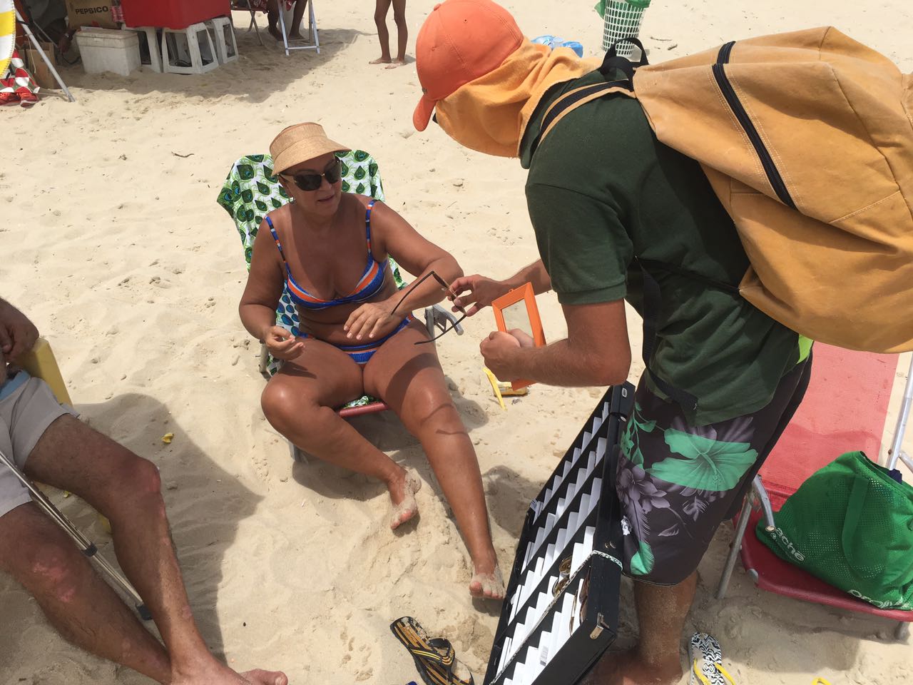
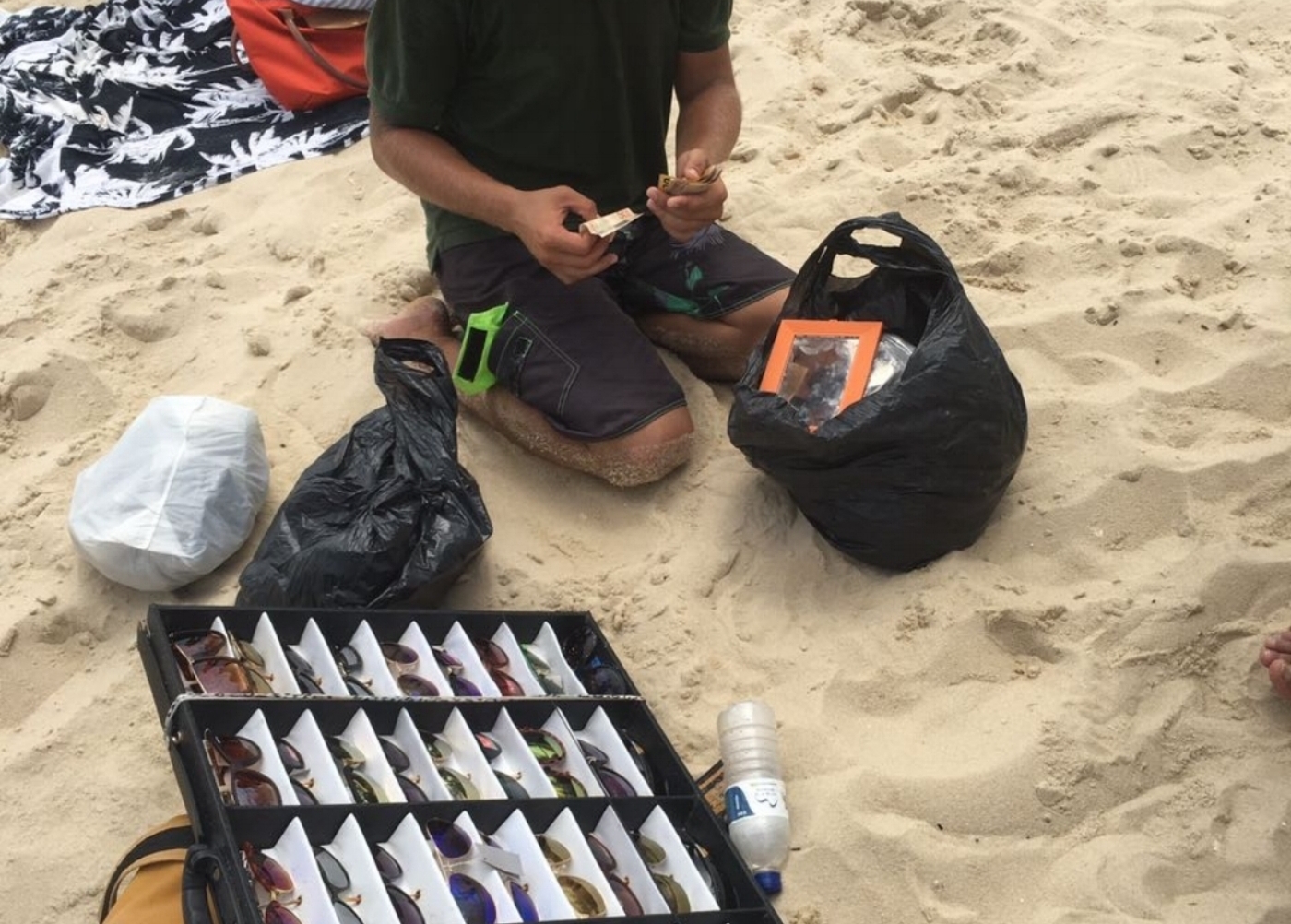
- Developed a contact in Brazil who conducted 1 interview in Portuguese with a man who sold sunglasses on the beach.
- Interviews uncovered data on style trends, selling habits and common purchasing techniques. E.g. a common price for sunglasses is ~30 Brazilian Real.
DISCOVERING LOCATION
Used interview data to investigate potential locations for our vending machine. I accounted for target audience and theft avoidance. Google Maps was used as the tool to locate a new style of shopping center with a warehouse feel.
PERSONAS
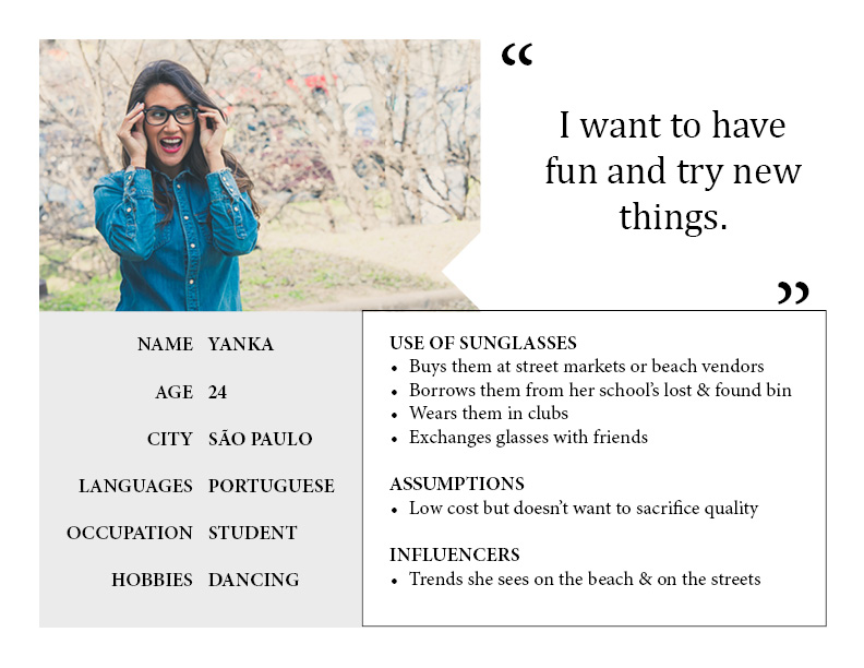
I based my personas off interview data. They represented the array of wants, needs, common goals, attitudes, and behaviors of our users. Primary and secondary personas were created.
UI FLOW CHART
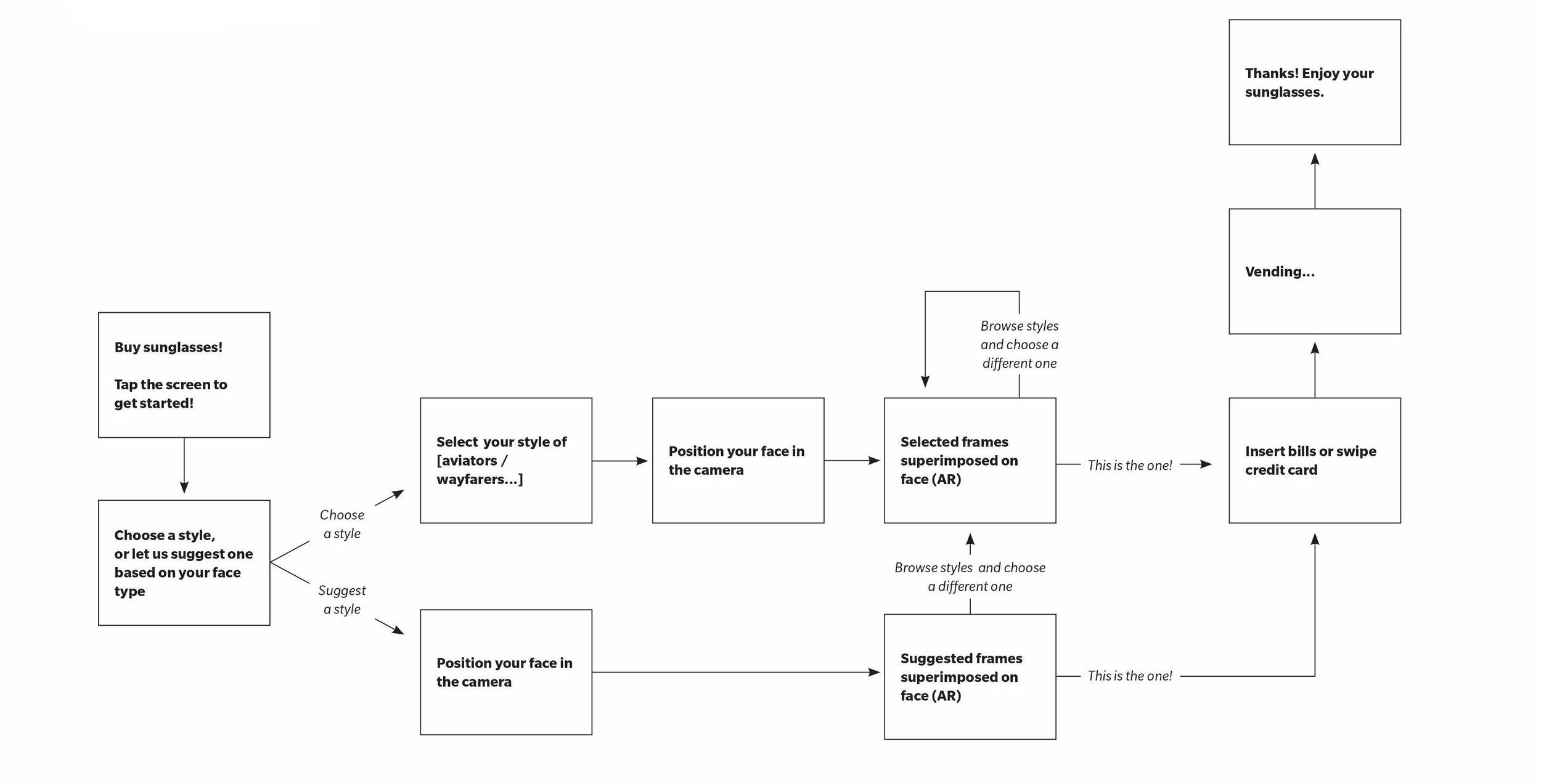
How a user would interact with the vending machine's UI to select, customize and purchase their sunglasses.
Final UI
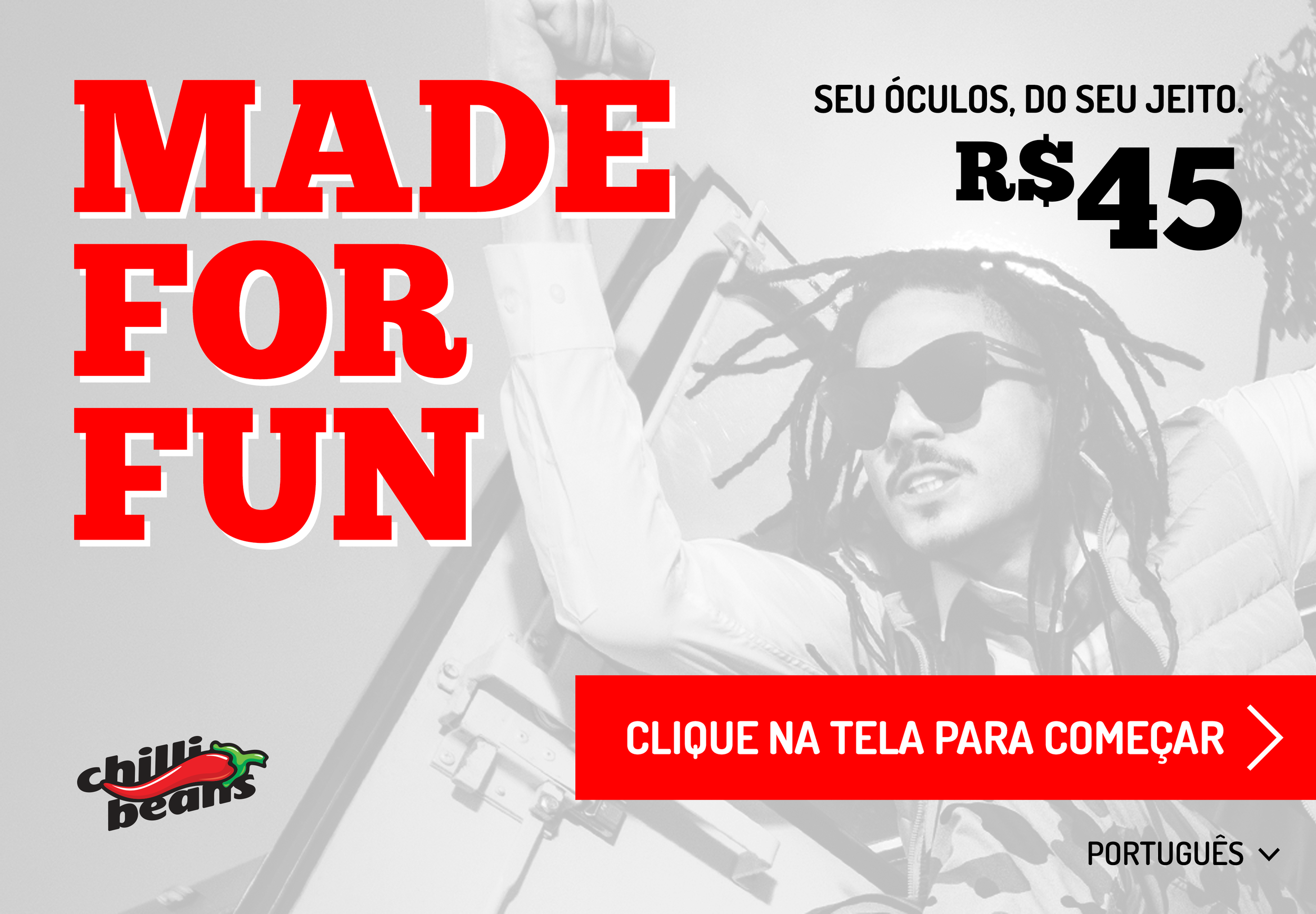
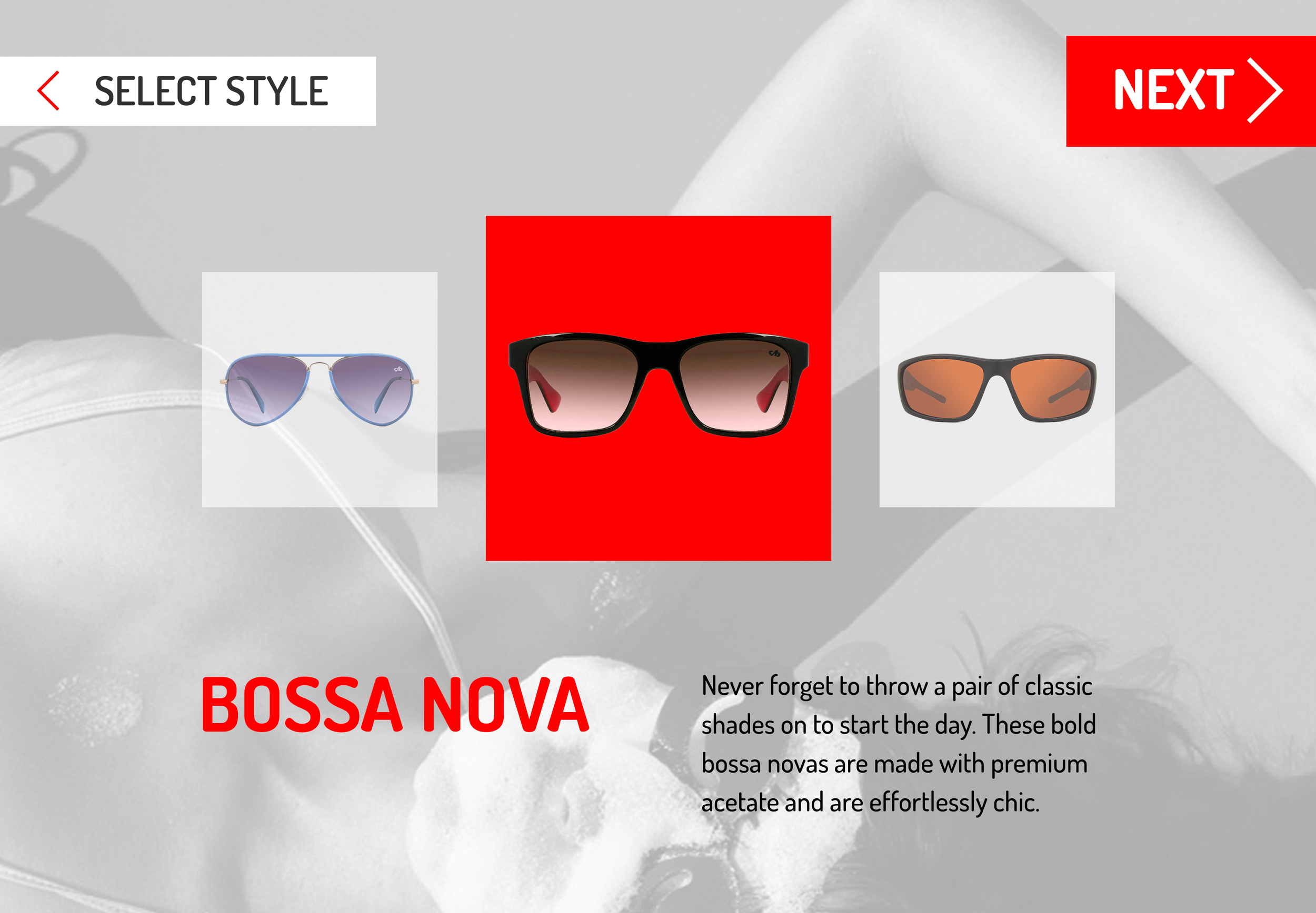
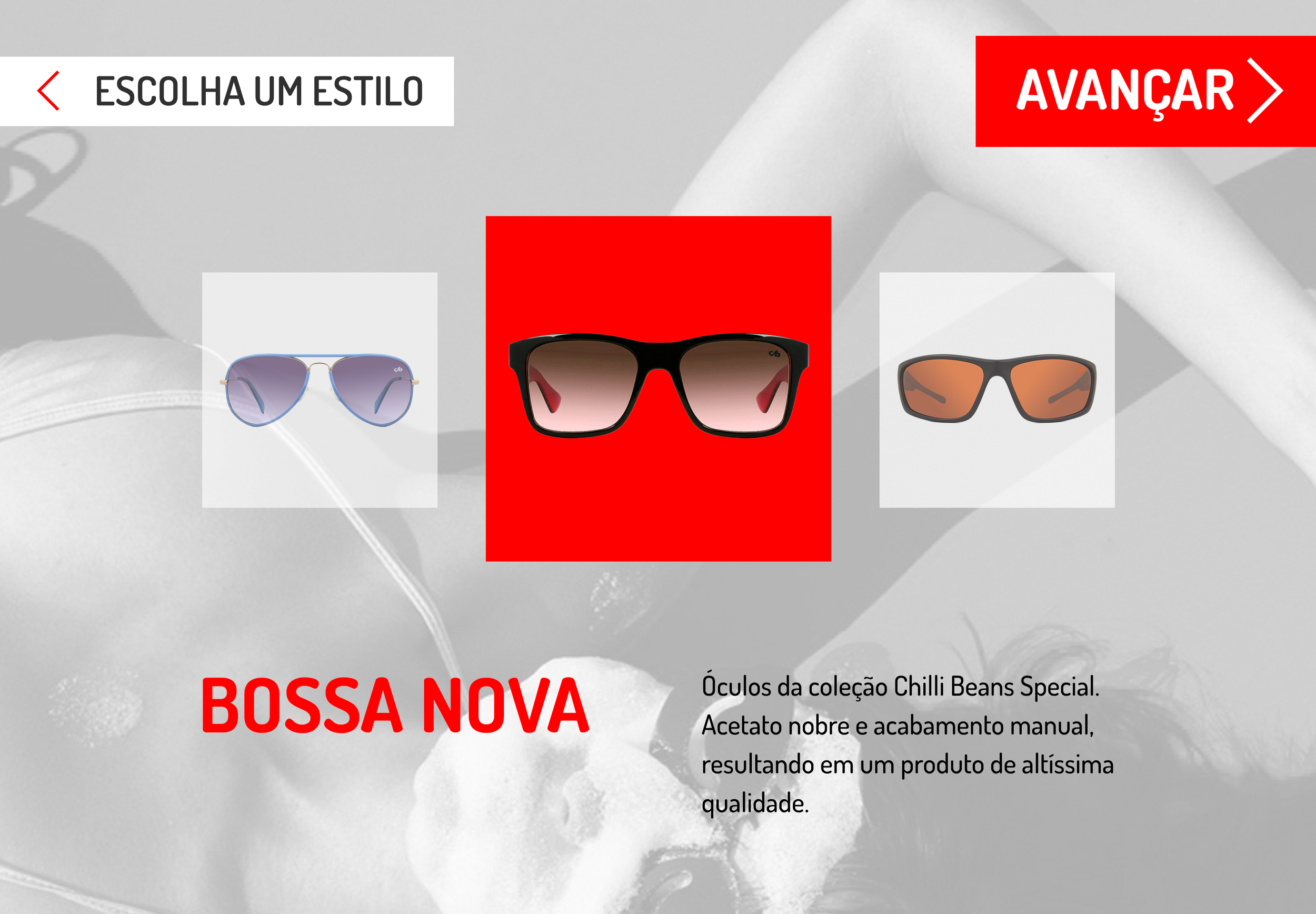
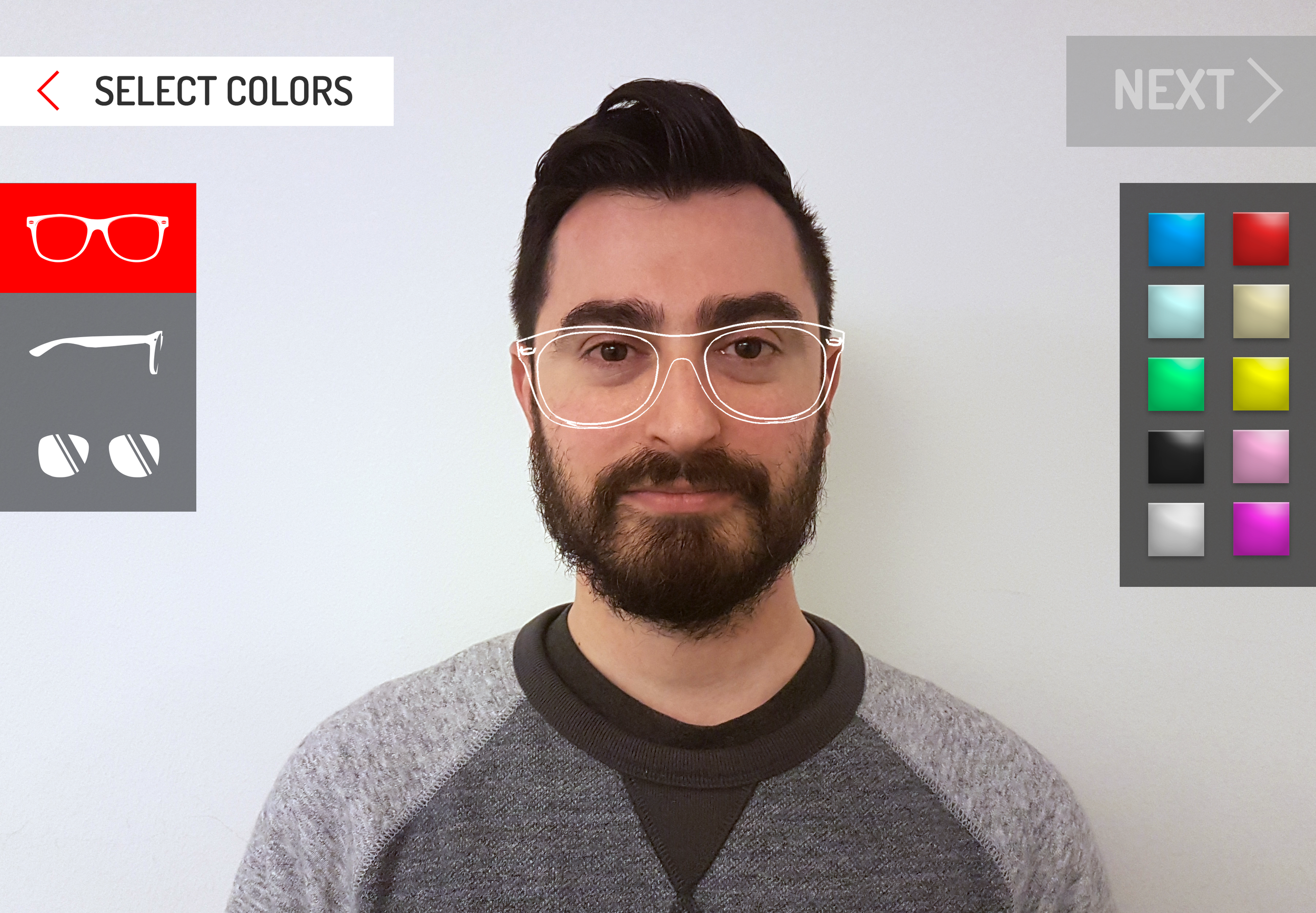
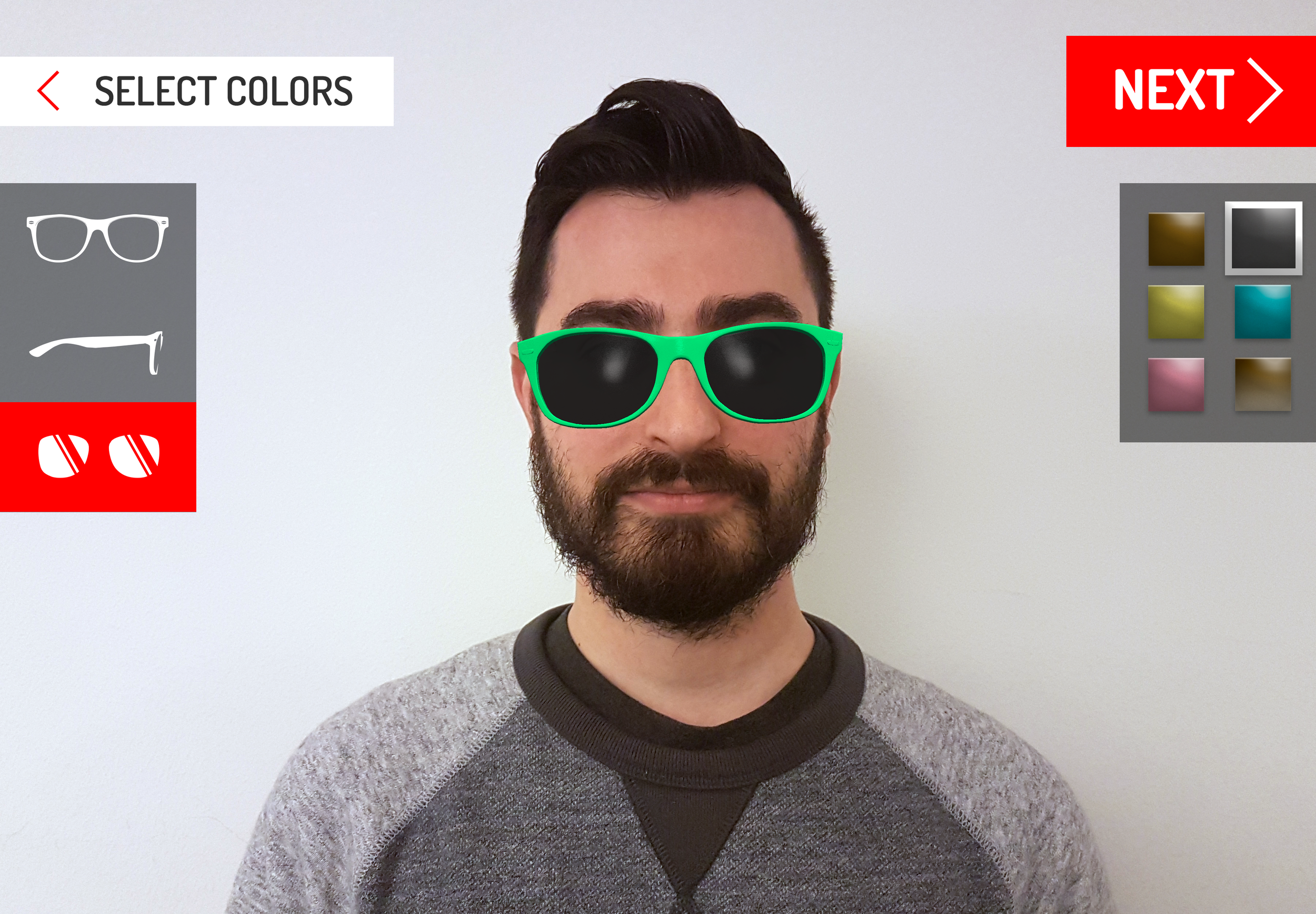
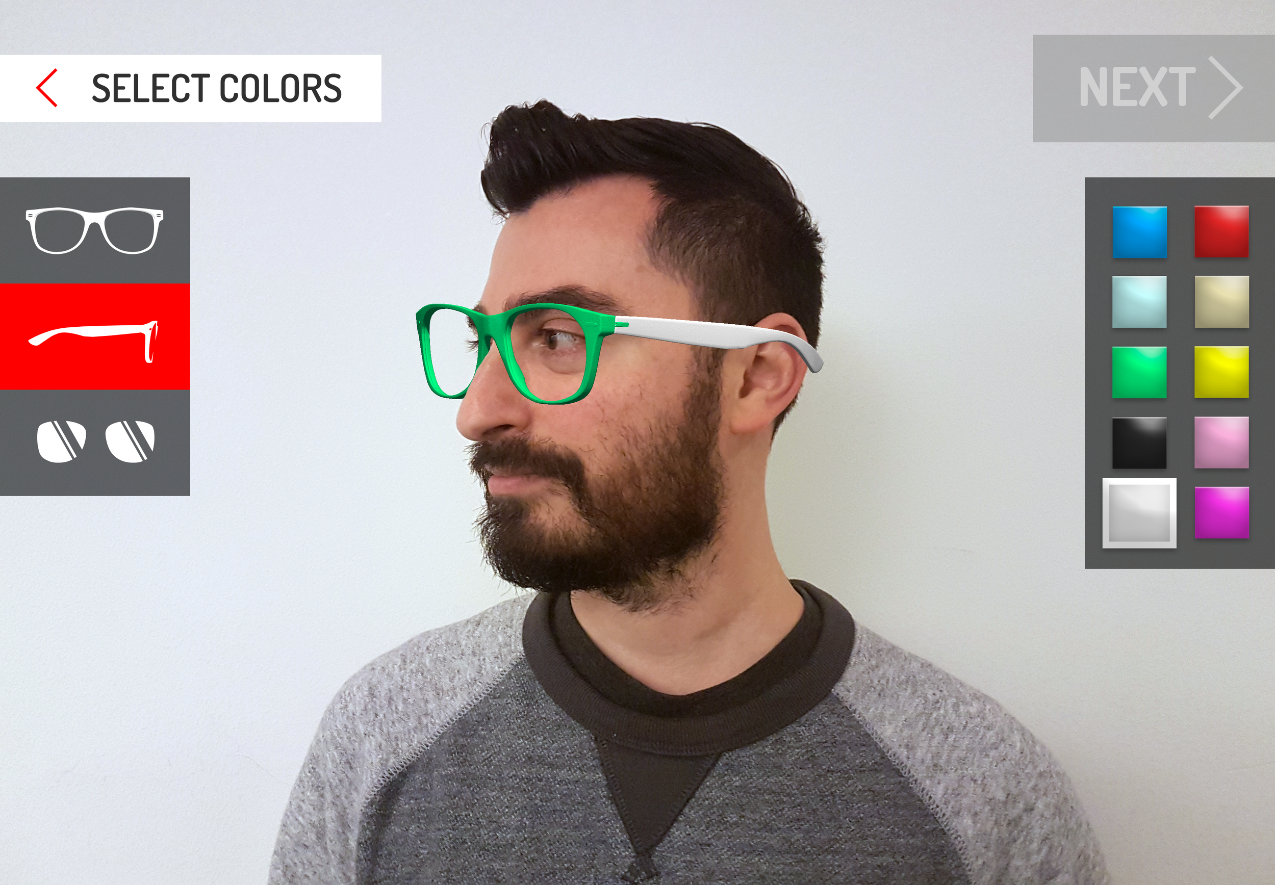
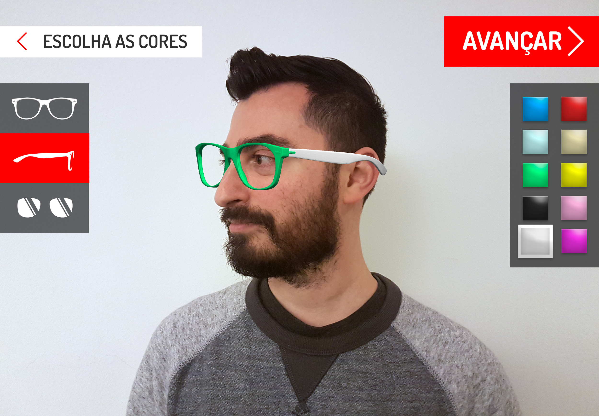
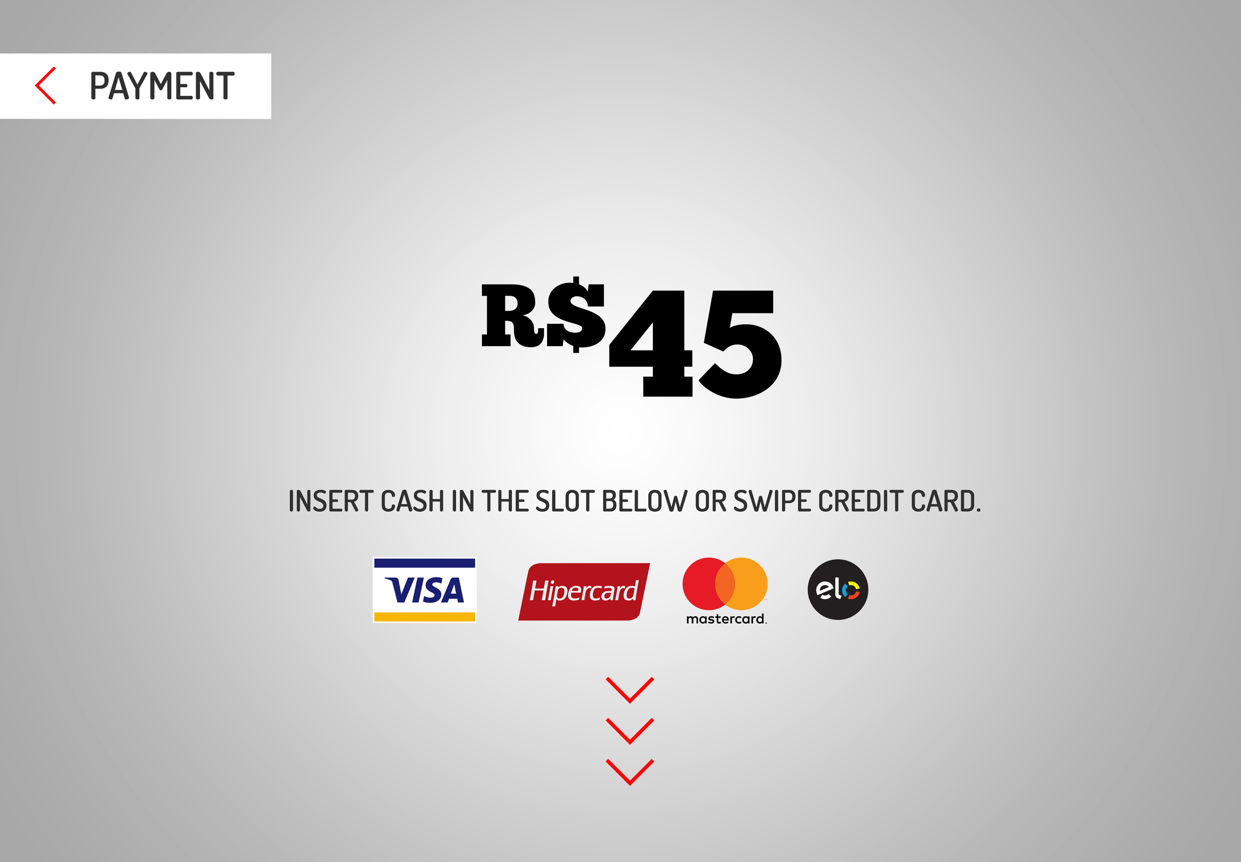
Both the English and Portuguese UI that a user would interact with to create and buy their sunglasses is displayed below. The flow allows the user to customize their sunglasses and virtually "try them on", similar to how Snapchat filters work. This is a fun way to satisfy the need to understand how the glasses will look on the user before purchase.
The interview data influenced many important UI choices:
- Allow for text expansion between English and Portuguese. This is displayed by the "Tap anywhere to start" text, which has room to expand on the page.
- Language option displayed as the text "English" instead of a country flag. A country flag could confuse a user since many countries have English or Portuguese as their official language. E.g. You could use the Brazilian or Portuguese flag to represent a "Portuguese" language option.
- Common payment methods in Brazil are still cash and credit rather than by phone, a method more common in other countries like China.
Visual design by our brilliant designer Tate.


